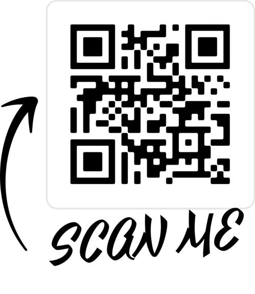

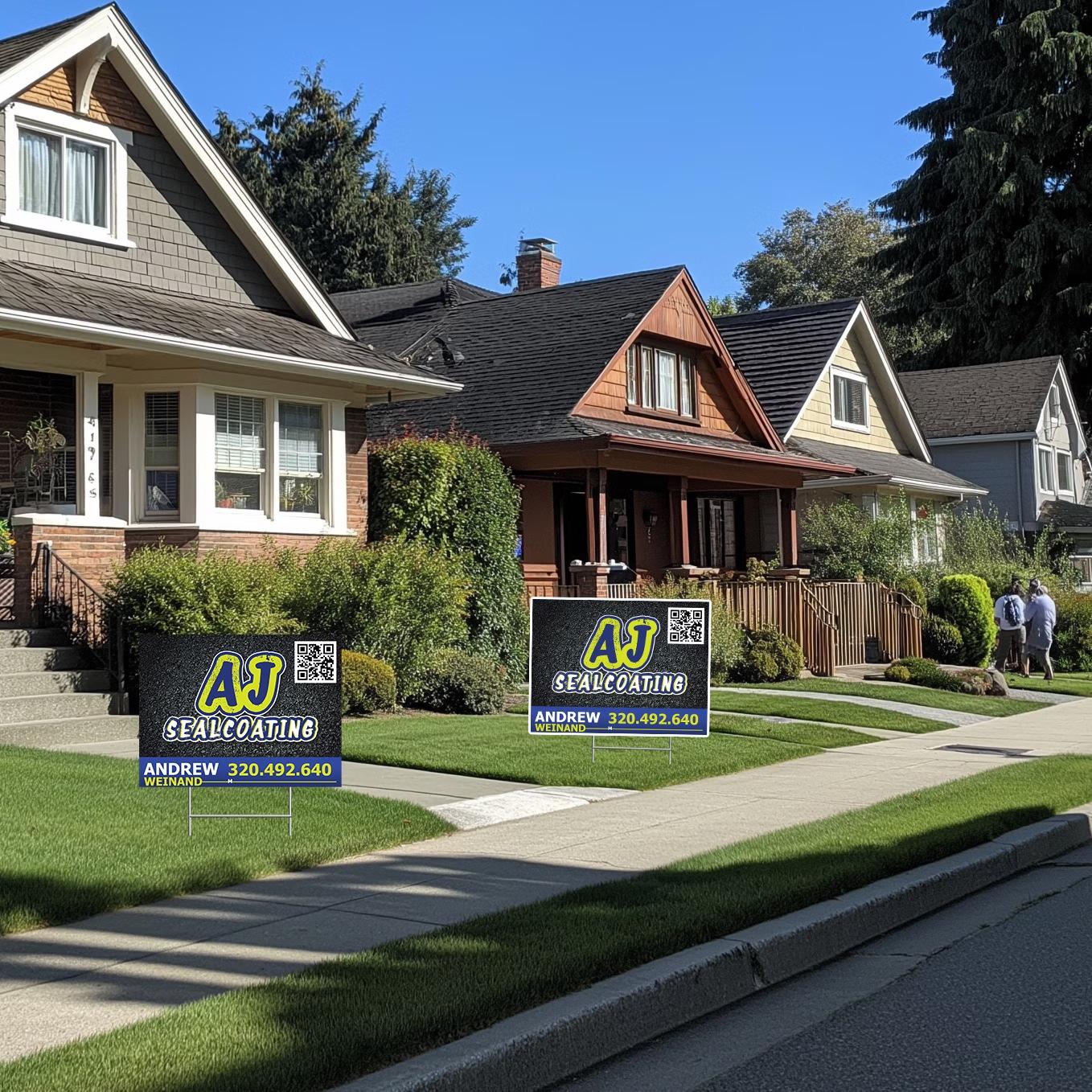
Use a QR Code
Connect customers instantly to your website or landing page. Track leads and update information easily.
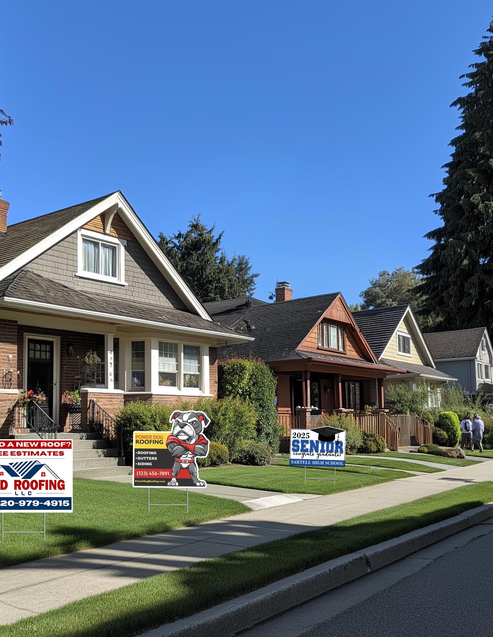
White Boarders
Use white boarders to standout from background distractions
Ditch Fancy Fonts
Use clean, bold fonts like Arial or Helvetica for easy readability from a distance.
Focus on High Contrast
Your text should pop off the background, and high contrast is the key to making that happen.
Stick to the Basics
Answer three questions: What you do? Who you are? How do I contact you?Keep it simple for maximum impact in 1-3 seconds.

Instant Connection
Customers can access your website or contact form with a quick scan.

Track Performance
Monitor how many leads your signs generate for better ROI analysis.

Flexible Updates
Change the linked content without reprinting signs, perfect for promotions.
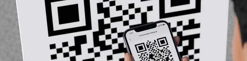
A yard sign without a QR code is like a car with a flat tire. QR codes are the easiest, fastest way to connect customers to your business. They also create a sense of urgency, as customers know they can save time by acting NOW. With a quick scan, potential leads can access your landing page, website, or contact form instantly. No need to memorize a phone number or URL which commonly leads to dropped opportunities.
Beyond convenience, QR codes also allow you to track how many leads your signs generate. Over 76% of unanswered phone calls or calls not returned within 5 minutes lead to customers going to the next option - your competitor. With QR's they immediately get a customer invested in you and allow you to immediately present and capture info not possible on a sign.
Flexibility with Dynamic QR Codes: With dynamic QR's, you can constantly update the link behind the code as needed, whether it's to showcase a special promotion or direct customers to a new higher converting landing page.
NOTE: Always make sure the QR code is big enough to scan easily, even from a car and always use a white clean background. If you're not sure where to start, the Bulljive Signs team can help you generate and manage a dynamic QR code to ensure it works seamlessly.

Improved Visibility
A white border creates contrast, making your sign stand out against various backgrounds.

Extended Lifespan
Avoid chipping or cracking of ink at the edges due to temperature changes in Coroplast material.

Cost-Effective
Many printers charge extra for full-bleed designs. A white border can save you money.
Add a White Border
If you've ever thought that full-bleed designs (where colors go to the edge) look more professional, think again. Full-bleed signs often blend into their surroundings, especially when placed on grass, near landscaping, or against dark building walls. A white border creates contrast, making your sign stand out and ensuring it's seen from a distance.
There's also a practical reason to avoid full-bleed designs. Coroplast, the material most yard signs are made from, expands and contracts with temperature changes. Printing ink directly to the edges increases the risk of chipping or cracking over time, leading to a worn-out appearance. On top of that, many printers charge extra for full-bleed designs. A simple white border not only improves visibility but also extends the life of your sign while saving you money.

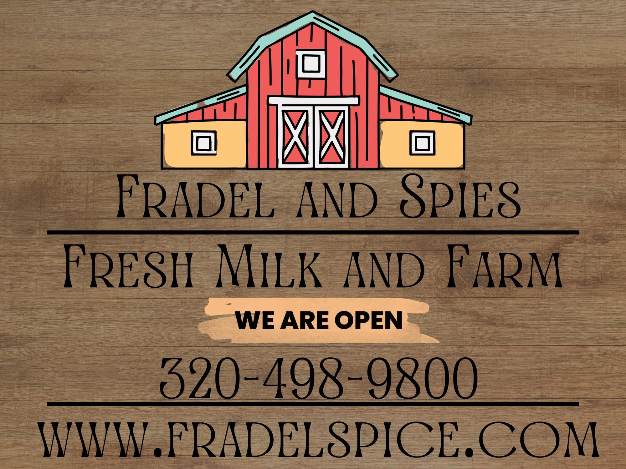
Avoid Decorative Fonts
Fancy fonts may look great up close but are disastrous for yard signs. Stick to clean, bold fonts that are easy to read at a glance.
Prioritize Action Over Style
Your yard sign doesn't need to match your brand's font or style. Focus on readability to drive action, not establish brand consistency.
Ditch the Fancy Fonts
Decorative fonts may look great up close, but they're a disaster for yard signs. If your text is difficult to read at a glance, you're losing leads. Stick with clean, bold fonts like Arial or Helvetica that are easy to read from a distance.
It's also worth remembering that your yard sign doesn't need to match your brand's font or style.The goal of the sign is to drive action, not establish brand consistency. Your website or landing page is where your brand style should shine. For yard signs, focus on readability first.
Before
After

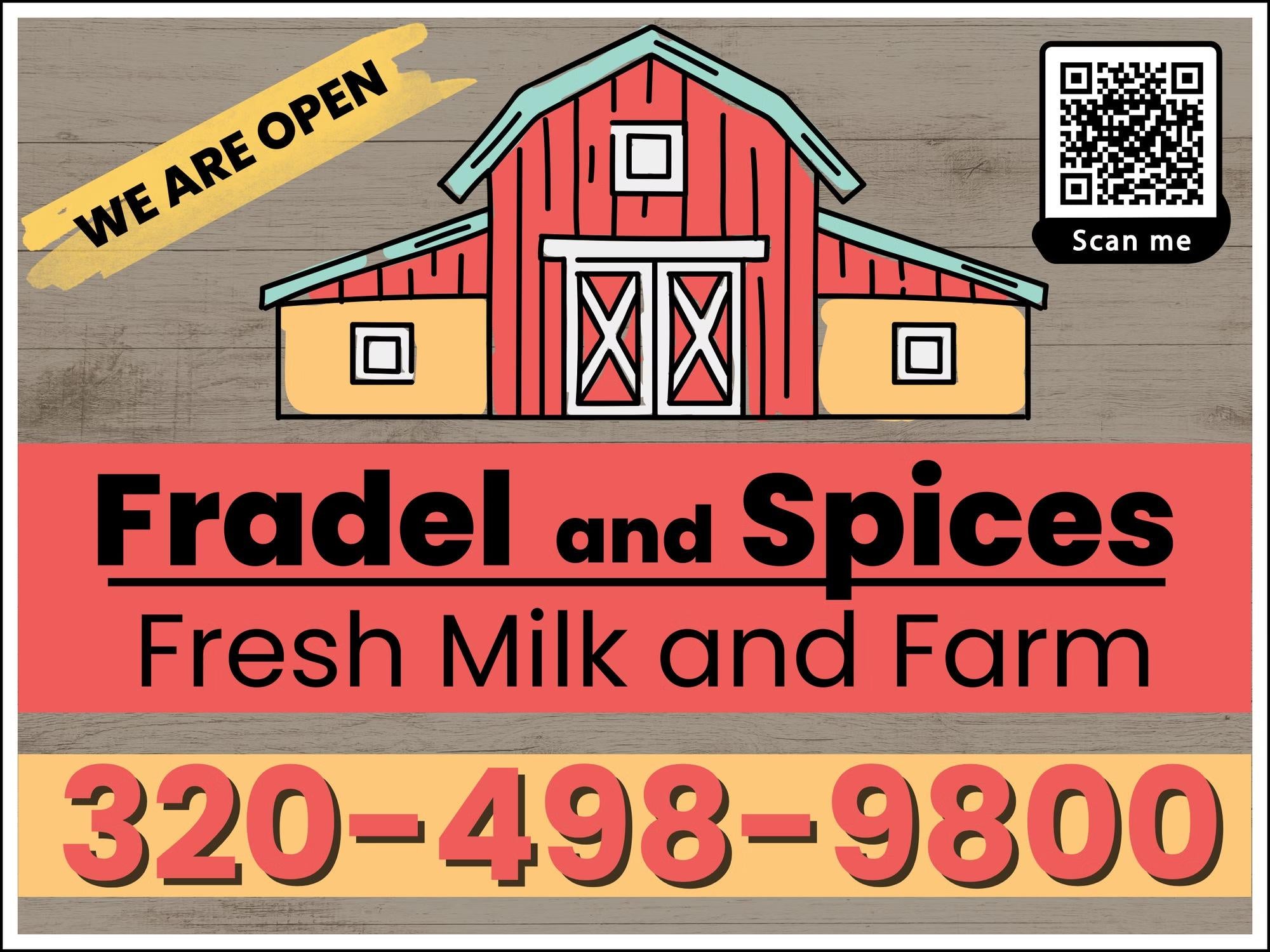
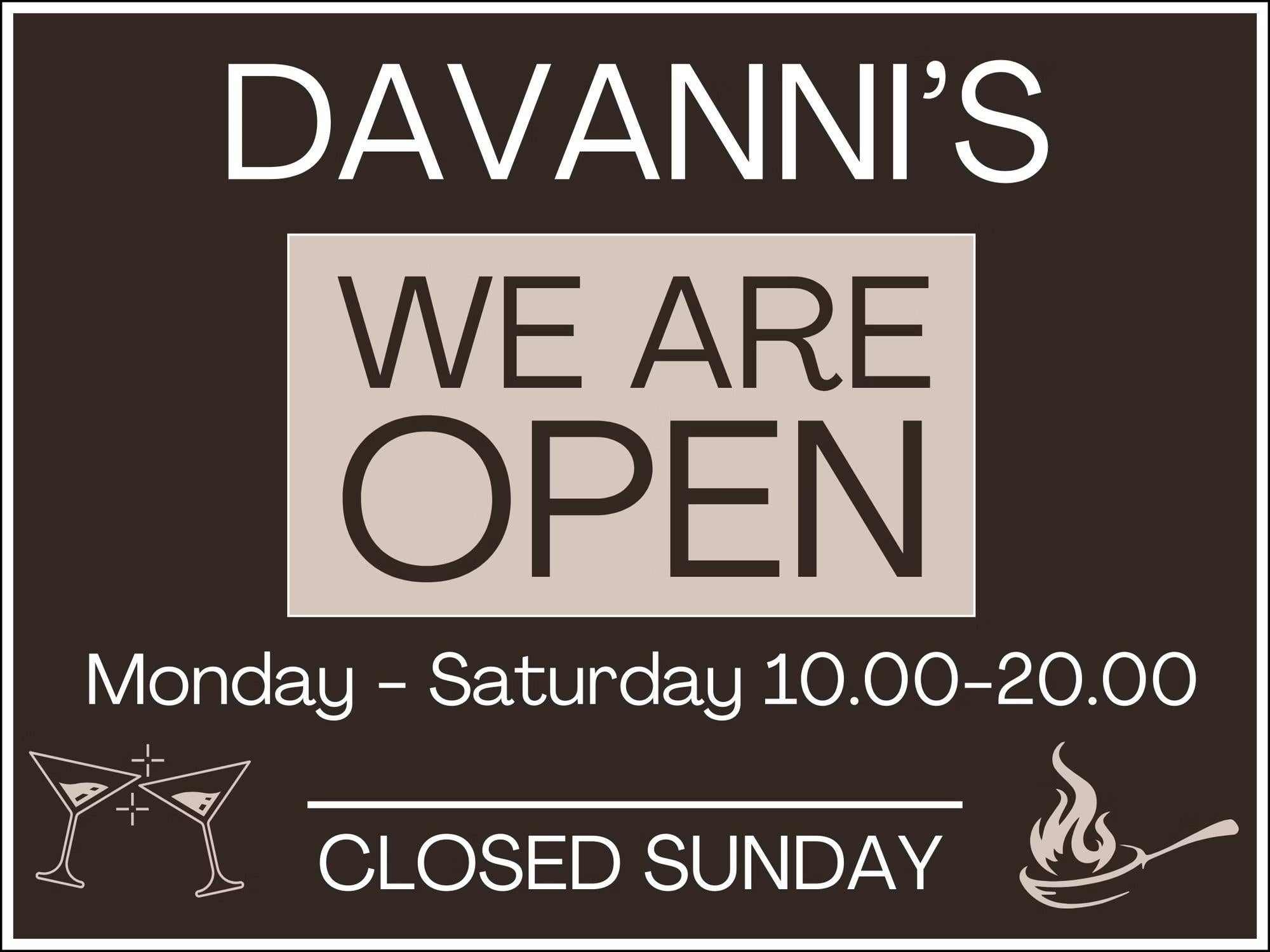
Choose High Contrast Colors
Dark text on light background or vice versa for maximum readability.

Avoid Busy Backgrounds
Steer clear of textured backgrounds or photos that can camouflage your message.

Solid Colors Win
Stick with solid background and text colors to maximize visibility.
Your text should pop off the background, and high contrast is the key to making that happen. Dark text on a light background4or vice versa4is much easier to read than light-on-light or dark-on-dark combinations. Avoid textured backgrounds or photos that can camouflage your message.
One of the most common design mistakes we see is layering text over a busy image or pattern. While it may seem visually appealing, it makes your sign harder to read. For the best results, stick with solid background and text colors that maximize visibility.

Before
After
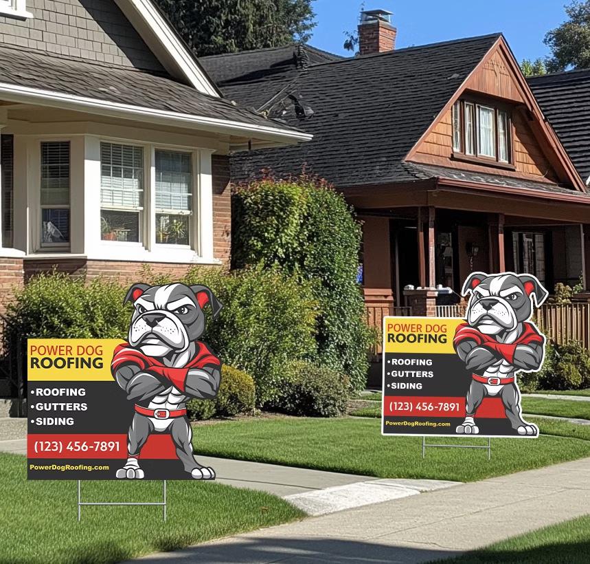
Stand Out with Contour-Cut Signs
We know all this simplicity sounds great, but sometimes you just want to have the yard sign that "knocks it out of the park." In that case, consider a contour-cut design. Over 90% of yard signs are standard rectangles, but custom-shaped signs-such as those featuring a logo or mascot that extends beyond the edges-immediately grab attention. While contour cutting is a premium option not offered by all sign shops, it can give your signs a competitive edge in crowded areas.
At Bulljive Signs, our CNC routers and flatbed printers ensure precision and affordability, making contour-cutting a seamless upgrade. If you want your signs to stand out while still utilizing the key design principles we've outlined, we're here to help.
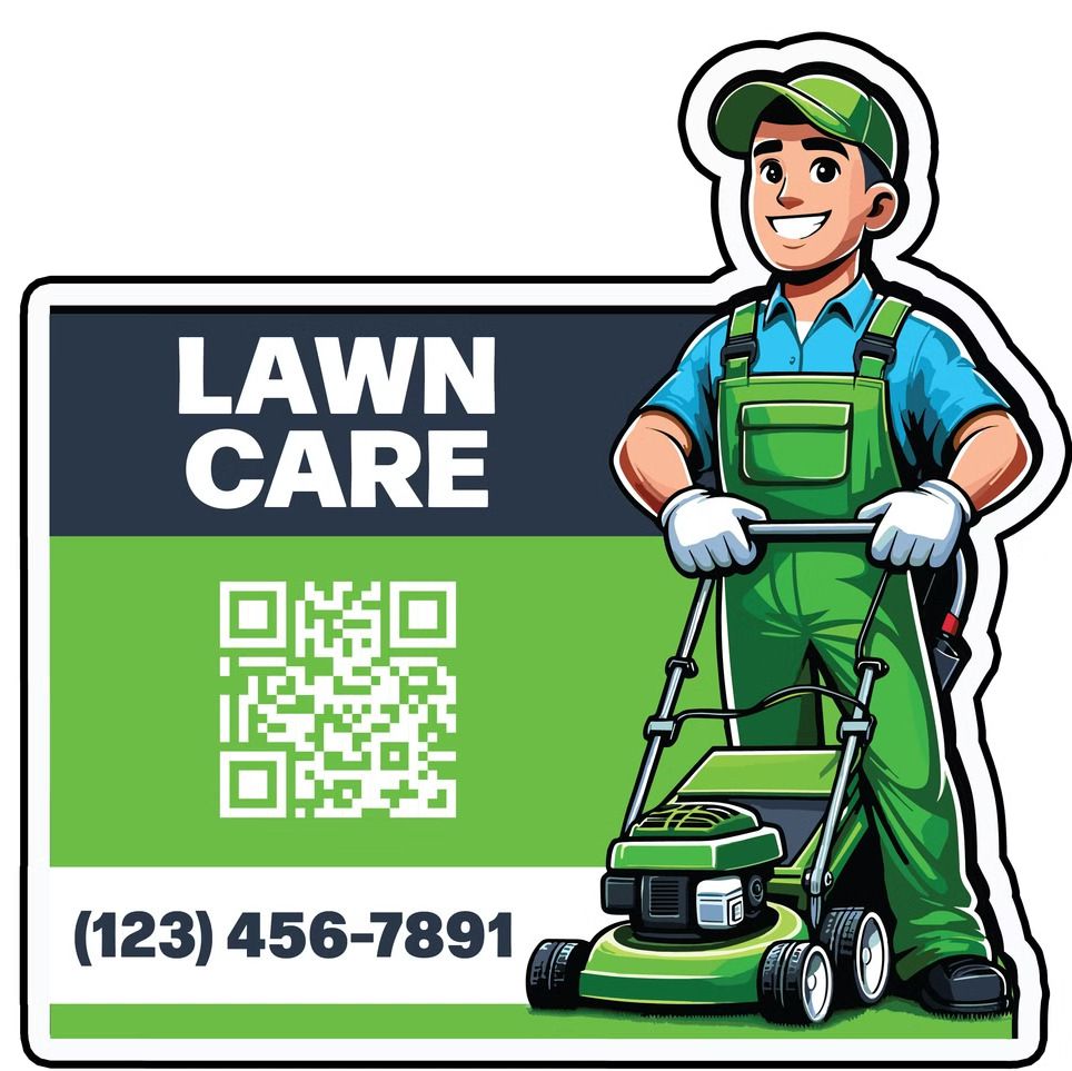
Unique Shape
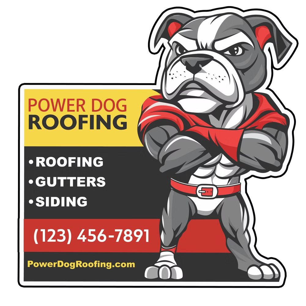
Competitive Edge
Conclusion: Yard signs are not brochures; they're tools designed to capture leads. Think of them as the tool to get your customers to your digital brochures, landing pages, and/or websites. The best signs are simple, action-focused, and easy to read. By following these five steps-keeping designs clean, using QR codes, prioritizing readability, adding white borders, and ensuring high contrast-you'll create yard signs that grab attention and deliver results.